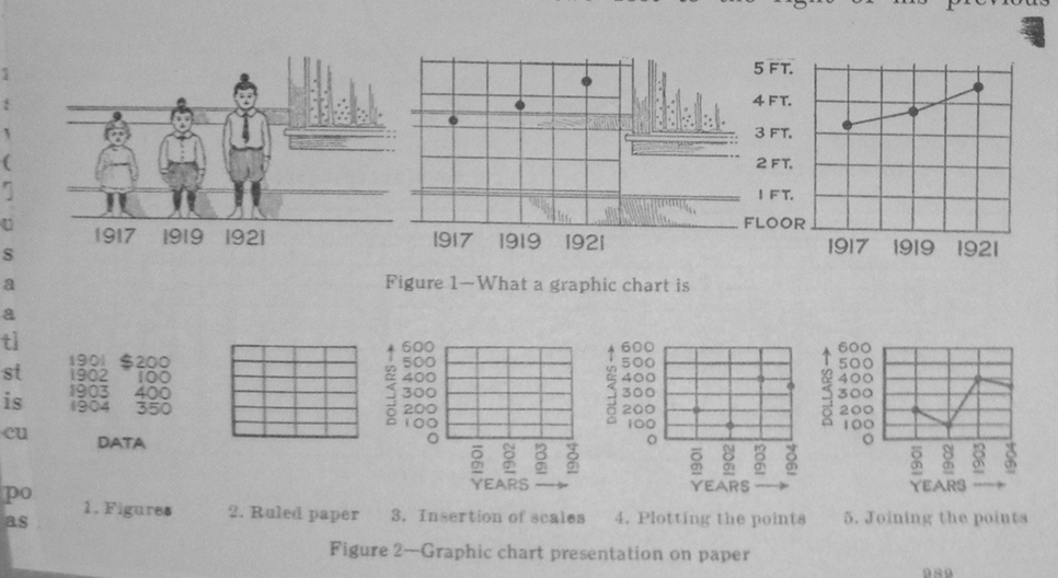
"What is a Graphic Chart?"
1 2017-07-06T07:37:46-07:00 Daniel Platt and Rachel Knecht 3ebb098c099a4564606054ddd3beb814ce8f359d 11862 2 Roger W. Babson Papers, Babson College (c. 1921) plain 2017-09-04T05:03:56-07:00 Daniel Platt and Rachel Knecht 3ebb098c099a4564606054ddd3beb814ce8f359dThis page is referenced by:
-
1
media/What a Graphic Chart Is 1921.png
2017-07-12T08:20:52-07:00
Arts & Charts: Picturing the Economy in Modern America
5
version 2
plain
478817
2017-07-13T08:41:01-07:00
The history of business charts rests on a fact that, on its face, seems relatively simple: the more complicated business became, the greater the need to present that information in an orderly fashion. Businesses became more and more complex as the nineteenth century turned into the twentieth, and as a result, the methods used to explain them also became more complex and innovative. In the antebellum decades, an update of the old-fashioned balance sheet used by accountants generally sufficed. By the middle of the twentieth, companies used lines, bars, circles, maps, and diagrams – while, of course, still holding onto the balance sheet.
Changes in charts reflected more than a need to creatively display a lot more information, however. They also reflected changes in people’s understanding of what the economy was, how it worked, and what they could expect from it. Early balance sheets were a way for individual proprietors to keep track of their own accounts, and in some cases demonstrate their business’s health to other people. But as corporations became more complex, they needed new ways of showing how they worked, and evaluating how they could work better. At the same time, how ordinary people understood the economy changed as well. In these charts, we can see conceptions of economic life move from one of individual transactions between people and small firms, to a complex mathematical entity represented by graphs and formulae that aggregated many individuals and firms into a whole.
-
1
2017-07-12T08:09:26-07:00
Arts & Charts: Picturing the Economy in Modern America
3
First version
plain
2017-07-12T08:16:20-07:00
The history of business charts rests on a fact that, on its face, seems relatively simple: the more complicated business became, the greater the need to present that information in an orderly fashion. Businesses became more and more complex as the nineteenth century turned into the twentieth, and as a result, the methods used to explain them also became more complex and innovative. In the antebellum decades, an update of the old-fashioned balance sheet used by accountants generally sufficed. By the middle of the twentieth, companies used lines, bars, circles, maps, and diagrams – while, of course, still holding onto the balance sheet.
Changes in charts reflected more than a need to creatively display a lot more information, however. They also reflected changes in people’s understanding of what the economy was, how it worked, and what they could expect from it. Early balance sheets were a way for individual proprietors to keep track of their own accounts, and in some cases demonstrate their business’s health to other people. But as corporations became more complex, they needed new ways of showing how they worked, and evaluating how they could work better. At the same time, how ordinary people understood the economy changed as well. In these charts, we can see conceptions of economic life move from one of individual transactions between people and small firms, to a complex mathematical entity represented by graphs and formulae that aggregated many individuals and firms into a whole.