Some Types of Data Visualizations in NVivo
Common types of data visualizations. Some common types of data visualizations include tables and charts, network graphs, cluster diagrams, treemaps, word clouds, maps, and others. (There are even more unique data visualizations based on particular learning domains.) In general, particular types of data visualizations are used with particular types of underlying data and data structures. This is so for both structured and unstructured data. Data visualizations are not used independently of their underlying datasets. Rather, the visualizations complement what is knowable from the underlying data, and vice versa. (Some data visualizations--such as concept maps--may be built on highly abstracted human thinking about an issue. These types of visualizations are less directly tied to an underlying dataset...but is based on human-processed information.)
Underlying datasets. Many underlying datasets are transportable between different data analysis software tools and different visualization tools to enable multiple queries and multiple visualizations—to mine the underlying data and expand people’s capabilities to learn from what they have. The same dataset may look very very different based on the layout algorithms applied (and the parameters of the data visualization). This is why it is important for those who use data visualizations in their work to explain where the data came from, how it was handled and cleaned, and what the data visualizations mean. Many publishers require the inclusion of underlying datasets when a work is published.
Creating Data Visualizations in NVivo
This page was set up to give readers a sense of some of the types of data visualizations in NVivo, how they are to be interpreted (broadly speaking), and what the look-and-feel is like. This section will not address how such visualizations are arrived at as that is included in other sections of this e-book. These visualizations are organized from the most “raw” and basic forms to the most processed (broadly speaking). In another sense, the more complex the data visualization, the harder the work it is to interpret the underlying data with accuracy.
The data visualizations in NVivo result from multiple processes. One may be something as simple as data ingestion, after which the user may access the uploaded data in order to view it. In some cases, depending on the structure of the information, the data will be presented—such as in a table for a summary format. The more commonly conceptualized type involves running queries or explorations of some data, which results in both a visualization and an underlying extracted dataset. Yet another comes from the “Models” feature, which users may use to manually create data visualizations; this feature also enables some machine support for the modeling (such as the ability to pull in particular related nodes or sources for the two-dimensional drawing.
Data visualizations may be drawn by data (in a machine-based way), or they may be drawn manually (by hand), or they may be created through both human- and machine- based processes.
Interacting with data visualizations within NVivo. Within the workspace, the researcher may engage with the data visualizations in different ways, such as by changing the parameters or underlying data and re-drawing the visualization. She or he may zoom in, zoom out, pan, and otherwise interact with the visualization. The 3D visualizations may be spun in a number of directions for viewing.
Image export. Virtually all data visualizations in NVivo are exportable in multiple file formats and data forms. Data visualizations may also be captured by screen capture tools.
Some Types of Data Visualizations in NVivo
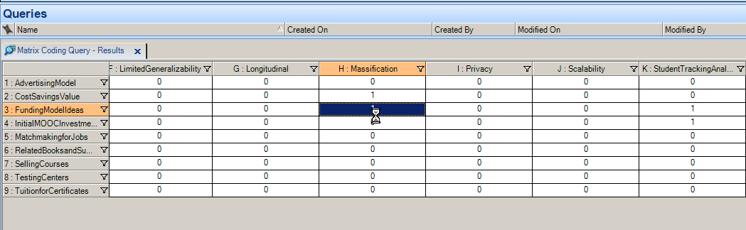
Matrix Visualization
A matrix visualization is the product of cross-referencing variables listed in both the rows and column. In the visualization below, a point-of-intersection is highlighted.
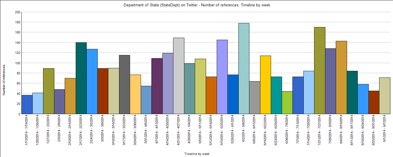
Chart View
An NVivo chart view is one of the classics of data visualization. This is better known generically as a “bar graph.”
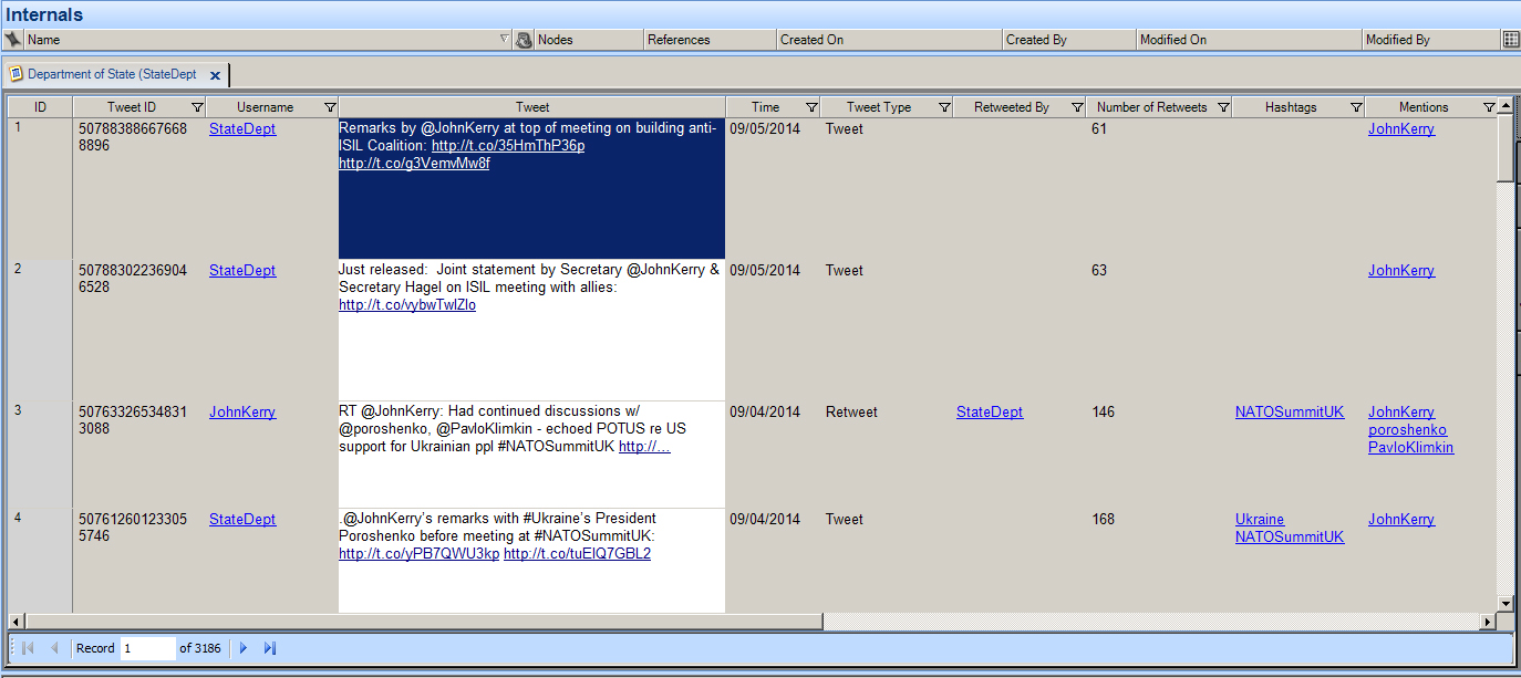
Form View
The “form view” in NVivo highlights one data record in full detail for close-in reading and engagement.
Table View
A common view of various types of spread-sheet-based data is the table view.
Manually Drawn Model View
The Model feature in NVivo 10 for Windows enables human-machine drawing of various static models that may be extracted from the data. A visualization may be purely hand-drawn. It may be purely drawn from the ingested data and the interrelationships found there. It may comprise information from human conceptualization as well as the data; in other words, it may be both hand- and machine-drawn.
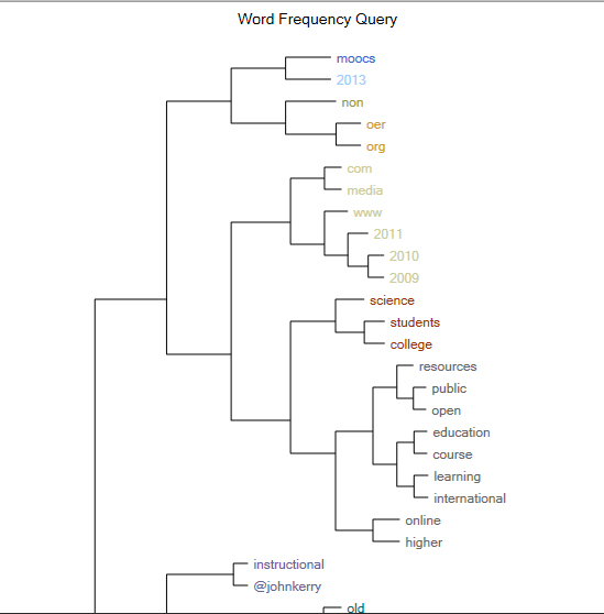
Hierarchical Clustering
Hierarchical clustering algorithms enable the extraction not only of high-level clusters but also sub-clusters within those larger clusters (or groups). One common type is expressed as a dendrogram (a tree with branches, sub-branches, and leaves).
Horizontal Dendrogram
A horizontal dendrogram is a kind of branching tree. The words that are on the same branch have some proxemics relationship in terms of co-occurrence in a text or a textual corpus (a collection of texts). This expresses a type of clustering.
Vertical Dendrogram
A vertical dendrogram has a top-down structure and is read top-down.
Word Tree
A word tree is created as part of a text search query. This word tree is interactive within NVivo, when a user may click on any of the branches to the left or the right of the focal word in order to see the entire sentence or phrase. This visualization provides a way for researchers to gain a gist of the word use—in its various forms.
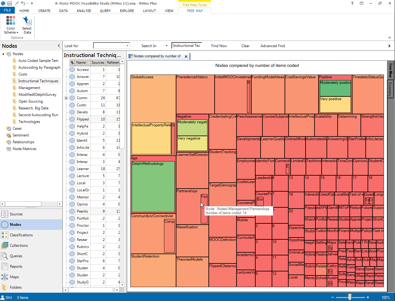
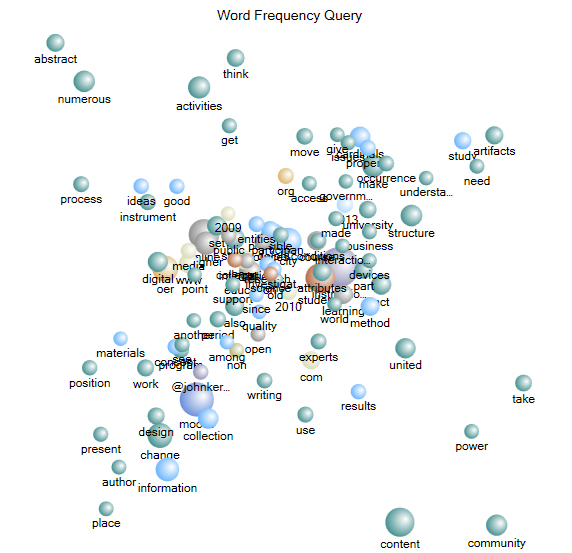
Treemap
A treemap is created from a word frequency count. The size of the region for a particular term is equal to the frequency appearance of that word. The more mentions of a term, the more important that concept may be for the text or text corpus or data set. The placement of the words at the left shows the most commonly used once. The words at the right at the lesser used ones. A generic “stopwords” (delete words) list was applied (as it is for all NVivo text frequency counts—unless a user chooses to suspend the use of such a list).
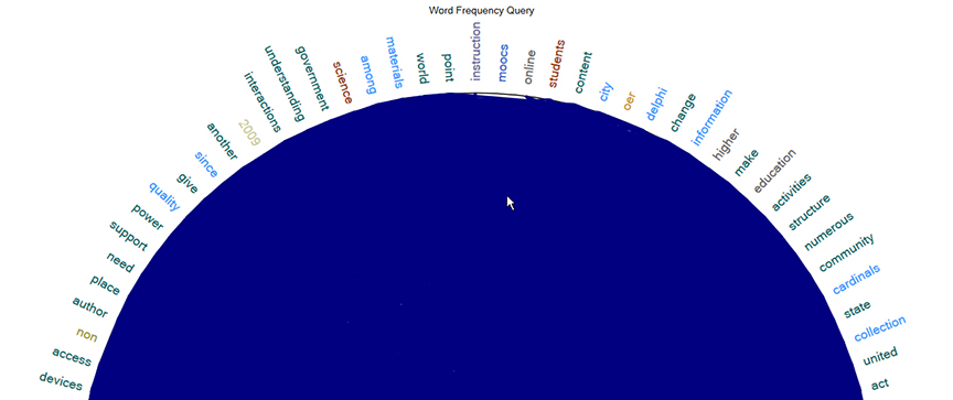
Word Cloud
A word cloud is another data visualization that is created from a text frequency count. Here, the sizes and other visual characteristics of words show their importance in a text or text corpus or data set. Also, the location of the words matter with many of the predominant ones in the center (in places of prominence). There are multiple styles applied to word clouds in NVivo.
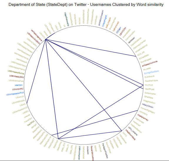
Ring Lattice Graph
The structure of a ring lattice graph is based on that of a node-link diagram. The nodes (entities or vertices) are placed on the ring. The links (edges) show up inside the ring to show interconnections or relationships.
Whole Ring Lattice Graph
While the above shows a close-in view of a lattice, below is a complete lattice with fewer links (so the relationships are clearer). A ring lattice graph shows inter-relationships between words (or other entities).
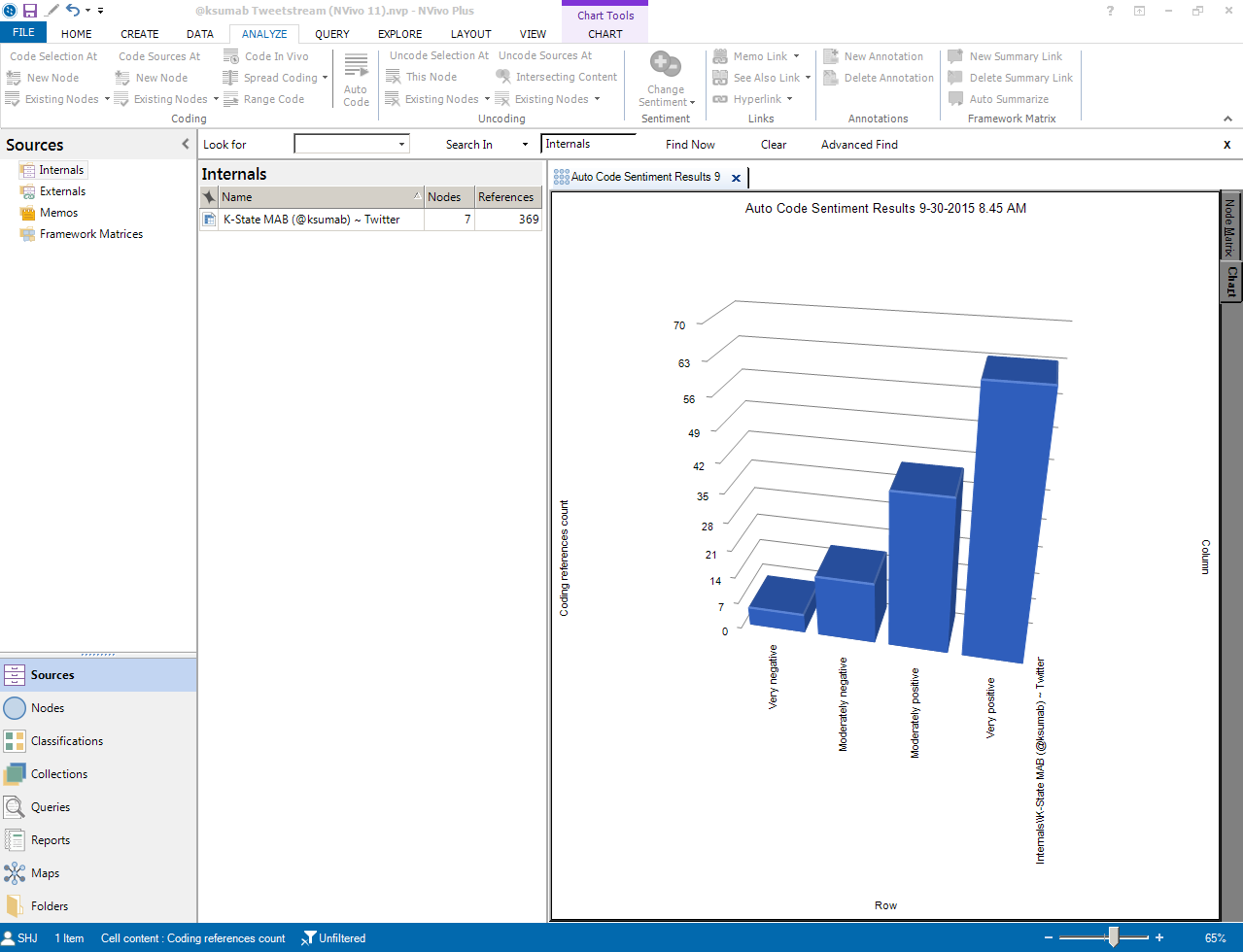
Sentiment Analysis Bar Chart
This bar chart is portrayed in a 3D representation. 3D representations are not only 2D representations but may be used with haptic devices for those who use a sense of feel to understand comparatives.
Cluster Diagrams
Clustering (of related elements in a large dataset) is enabled by unsupervised machine learning that connects words that are related to each other. In common types of clusters, words may be connected based on various types of semantic-based relationships: synonymy, homonymy, antonymy, hypernymy, hyponymy, metonymy, metonymy, holonymy, and others. In some types of clusters, the relatedness is based on proxemic co-occurence [Do the words appear in the same sentence or paragraph or document or corpus (note the changing units) as other words? If so, they are related. They are from the same context. Their existence in proximity highlights some aspect of meaning as informed by context.].
Because NVivo goes with an unsupervised (without direct human input) approach, the researcher does not determine the number of clusters. Rather, the data itself is the determinant of how many clusters are extracted. On the back end, there are likely some delimiters that ensure that the numbers of clusters are not so excessive as to make the data visualizations too crowded to be readable.
The clustering feature requires a certain base amount of information in order to have sufficient data to extract clusters. For example, a word frequency count over a whole project's text may enable the application of a clustering algorithm vs. just one run over some nodes or raw text data in a folder.
Researchers who interact with qualitative data use clustering to explore potential patterns and interrelationships that they may find. These visualizations also offer a bridge into the data for presentations and publications.
2D Cluster Diagram
The relationships between words or concepts in a text corpus or dataset may be presented in a two-dimensional cluster diagram. [Usually, with k-means clustering, a human user may determine the number of centroids or the centers of the respective clusters or groupings. There are randomly selected centroids for various clusters, and then the other elements around those are moved to the nearest centroid. A designated centroid may be changed if there is better fit between a different entity--in this case, word--than the randomly selected one. The clusters are depicted within a Voronoi diagram, in which partitioning lines are overlaid to more clearly differentiate node (word) membership in a particular cluster.]
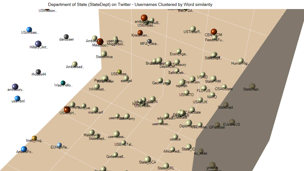
3D Cluster Diagram
The same word relationships may be visualized in a 3D cluster diagram. Within the software tool's active pane, this visualization is interactive, and the whole diagram may be rotated in a number of directions and zoomed-in and zoomed-out for increased user engagement and insight. (Just click on the image, hold down the left mouse menu button, and move the mouse. Or left-click using the touchpad, hold, and swipe across the touchpad to move the three-dimensional image.) When it is exported, though, it is a static 2D image (that visually somewhat emulates 3D).
To read the data on the 3D cluster diagram, it helps to zoom in and out...and to rotate the diagram to view it from various angles...in order to understand the extracted relationships. Also, some data about the clustering is included in the colors of the nodes, so it helps to be able to see color.
Going into so-called three-space helps researchers better see the different clusters and to examine them for meaning (since these nodes in the cluster are identified as being associated or similarly related to other nodes of the same color and in the same proximity).
This above cluster chart shows users who are clustered based on language style matching (LSM), which may suggest that they are having a mutual discussion around shared areas of interest.
Geographical Map
NVivo enables the drawing of a geographical map based on the user-provided geolocation indicators (usually decimal degrees) in a Tweetstream dataset. The coordinate points are plotted on OpenStreetMap tiles provided by MapQuest. The map "scale" tends to be fairly broad depending on the data, such as whether global or within the continental U.S. or other. The map itself offers a broadscale summary of places where microblogging communicator accounts were registered.
The first map (directly) below shows a typical global-scale view.
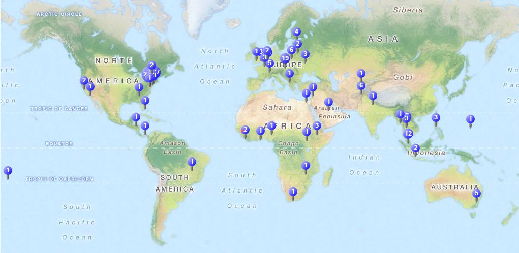
The next map (directly) below shows a typical continental U.S. view. Of course, there are many other types of views available depending on the region-of-focus.
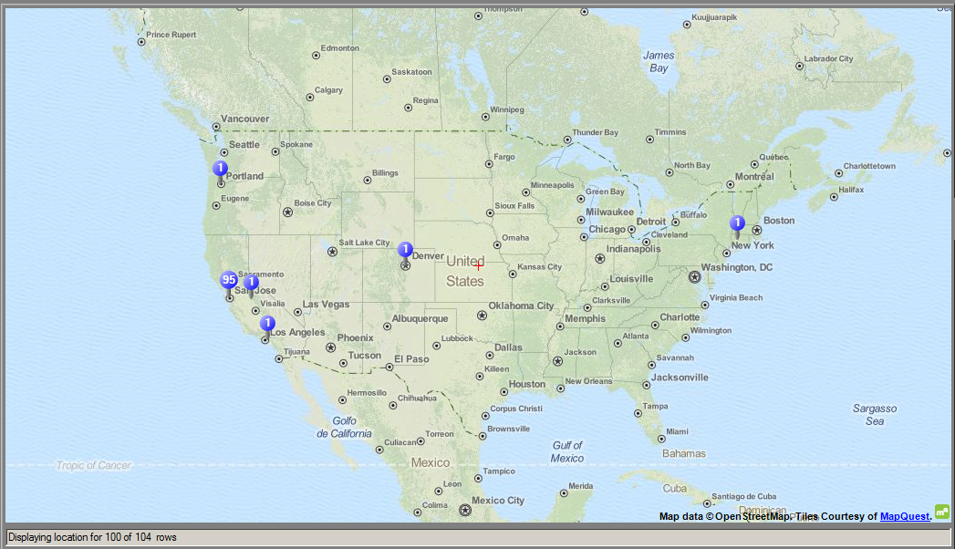
Choosing the Right Visual
There are nuances in data visualization, and it helps to think through how to best visually represent the underlying data. Some data may be better represented in multiple ways, with each visual focusing on a particular aspect of the data.
Revisualizing Data Outside of NVivo
Some of the data in NVivo may be exported in table format and re-visualized outside data. For example, datasets with geolocational data may be re-mapped in Tableau Public or BatchGeo (which are free online tools). Model elements may be copied and pasted into Microsoft Visio for more complex elaboration and re-visualization. Those are the only ones that come to mind currently.
Under the Hood of Autocoding and Machine-Learning Processing Features
Finally, it would be helpful for QSR International to share more information about the algorithms being used for the various data extractions and visualizations for academic researchers to use for understanding, analysis, description, and publication. For some researchers, the visualizations themselves are sufficient. For many, though, it would help to know what is actually being done with the data, given the breadth of possibilities (lots of clustering algorithms available all focus on different dimensions of data, for example). It would be helpful to know what some of the internals are that inform the extraction of clusters and their drawing.
Some light inferences may be made. For NVivo, the clustering focuses on (meaningful) semantics and proper nouns (Named Entities) and a filtering out of syntactic terms. There is little in the research literature about what is going on, and QSR International does not currently offer much in the way of direct information on what is going on under the hood related to machine-based data processing and data visualization.
| Previous page on path | "Using NVivo" Cover, page 35 of 58 | Next page on path |
Discussion of "Some Types of Data Visualizations in NVivo"
Add your voice to this discussion.
Checking your signed in status ...