Quantitative Data
The key takeaways from quantitative data include:
- When women are represented (which is infrequent) they are often allegorical figures, not real people.
- Marianne is the most frequently depicted woman in La Caricature and she is a victim of violence more often than she is not.
- In private, interior spaces, images with women outnumber those without, indicating a connection between domesticity and femininity.
- In crowds of ten or more, there are rarely more than three women - their representation in La Caricture is nowhere near proportional to their participation in public life.
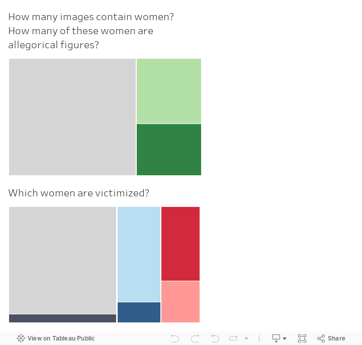
The first chart shows how many total images include women and how many of those women are allegorical figures. The total area of the chart represents all of the images that I examined. The area of the gray portion represents the 242 images that did not include women. The combined area of the green rectangles represents all of the images with women. The dark green portion represents images with allegorical women and the light green portion represents images with non-allegorical women.
Key takeaways from these two charts:
- The majority of examined images did not include representations of women.
- When women were represented, there is nearly a 45% chance they are an allegorical figure.
- Marianne accounts for nearly half of the allegorical women represented.
- Marianne is depicted as a victim of violence more often than she is not.
- 16 out of the total 26 images of violence against women depict Marianne as the victim.
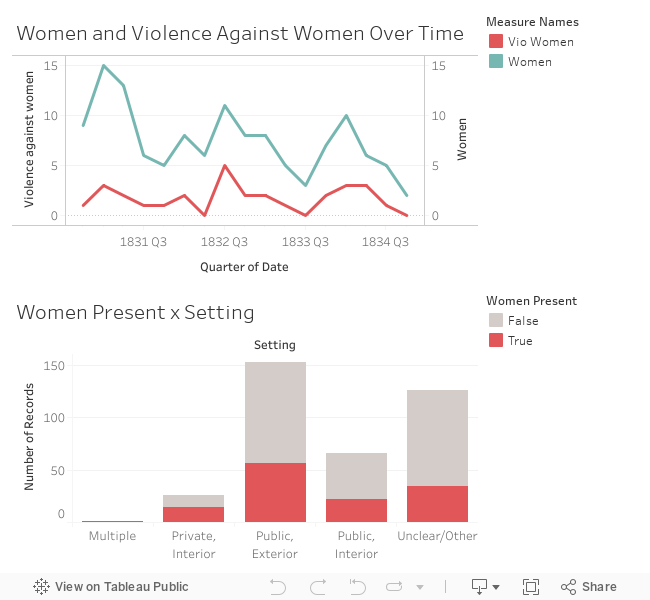
The graph below represents trends over time in the representation of women and violence against women. The blue line represents the total number of images of women. The red line represents the total number of images that depict violence against women.
The following bar chart shows the settings in which women were represented in caricature. The height of bar represents the total number of images depicting a certain setting. The purple section represents the total number of images that represent women in each particular setting. The gray portions represent the total number of images in each setting that do not include women.
Key takeaways from these two charts:
- While total representations of women outnumber representations of violence against women, images of gendered violence are consistent throughout time. Spikes in images with women nearly always coincide with spikes in images of gendered violence.
- The majority of images are set in public, exterior spaces like parks and city squares.
- Images with women in private, interior spaces outnumber those without. This identifies a clearl connection between domesticity and femininity.
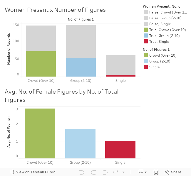
The following bar graphs examine women’s representation in images with different amounts of people. Images were coded as depicting no figures, a single figure, a group of figures (2-10), or a crowd (over 10).
The first graph shows what portion of total images that fall under each category include women. The second graph shows the average number of female figures depicted in images in each category.
Key takeaways from these two charts:
- Women are more likely to be represented as part of a group or crowd than individually.
- Out of the 60 images coded as individual portraits, only 4 of them (6.67%) depict women
- In images of groups (2-10 figures), an average of about 1.7 of these figures are women. There are few, if any, images of groups of women.
- In images of crowds (over 10 figures), there are an average of about 2.9 women. On average, women account for at most 28.7% of figures in crowd scenes. This is nowhere near proportional to the proportion of women in the population nor their contribution to public life.