Crisis Coverage: Mapping Rohingya Stories
This interactive map emerges out of my extended research on the Rohingya Crisis and how it is represented in the news. The news as such is an aggregation of materials, interviews, and witnesses that is already mediated by the ideologies of the sources and re-mediated in as a news story. With these varying levels of mediation, the news participates in the construction of how data and information become facts and knowledge about reported events. The Rohingya crisis is not an exception from this cycle. Its representation in western media (particularly, media in English) has undergone various forms of mediation and transformation. The interactive map here, then, is an aggregation of aggregates that puts into conversation information conveyed in text and image form.
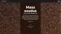
While previous interactive maps have mainly used a variety of information graphics in a sequential order to portray information, the interactivity of such representations is limited to a linear format (see figure 1). This project seeks to go beyond singular source material and fixed paths of exploration. The purpose of this map is to not only bring together different forms of knowledge about the Rohingya Crisis into one space, but it attempts to address and imagine how information and knowledge is conveyed about an on-going crisis. In this case, much is at stake as the conditions of the Rohingya has been declared a humanitarian crisis. How can we use data to imagine events and people who happen or exist elsewhere? What does interactivity add to or take away from the representation of a crisis? This interactive map is a mode of representation of aggregate data that veers from traditional news models that are timelines or simply archived lists. It seeks to explore new ways of representing information to examine how knowledge is constructed about current events.