Displacement #3: Itinera as Code
Displacement #3: Itinera as Code
By Vibeka McGyver
My introduction to Itinera began when I was a first-year computer science student and had the opportunity to work on a long-term project focused on updating Itinera’s “Travelers” visualization. The Travelers visualization was initially very intimidating to me. I was not familiar with the historical aspect of the data, and I had no idea how the code worked. Over the past four semesters of working on Itinera as a student, I have had many new and important learning experiences. This project has increased my understanding of how to work with data, specifically unfamiliar data. I have also had the experience of working in a computer lab environment with a team of people who are all engaged with different parts of the same project. In the lab, I have learned the value of having an understanding of everyone else’s contributions, processes, and goals. Over this time, I have also developed a better understanding of the value of Computer Science in combination with Art History and other disciplines. The process of teaching myself a new programming style has also resulted in a fair deal of trial and error, which has frequently led me into and out of rabbit holes. I can now better distinguish these rabbit holesRabbit Holes
The concept of research "rabbit holes," or the feeling that you have entered a bewilderingly large and complex array of new concepts and understandings, is one that has come up consistently throughout the process of creating this roundtable for Journal18. Each of us has experienced the feeling of opening the door onto a new idea, and falling down into a state of deep insecurity. If one spends enough time persevering in a research rabbit hole, however, soon patterns begin to appear, light begins to dawn, and real, hard-earned learning occurs. They become much less frightening—but no less elucidating—with time and experience. and climb out of them more quickly than I could in the beginning. I have learned the value of what a data visualization can offer to students, researchers, and anyone curious about data relationships. Working on Itinera has been a very informative, yet challenging, opportunity, which allowed me to experiment with different approaches.
In the beginning, I did not know where to start,Learning to Code in the Digital Humanities
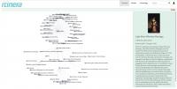
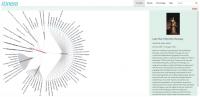
The process of working mindfully with digital computing sits at the heart of Itinera as it is enacted within the Visual Media Workshop. Why we are using computing to get at our interpretations is as important as the individual effectiveness of our techniques. From a traditional computer science point-of-view, learning the "grammar" of computing often precedes the functional experience of using this tool in a context important to the student. In the VMW, we try to provide real-world experience for students to work with, through, and around digital computers, focusing more on their acquisition of a sense of self-sufficiency than on individual tasks completed, data entered, or lines of code written. For more thoughts on this approach, please see, David Birnbaum and Alison Langmead. “Task-Driven Programming Pedagogy in the Digital Humanities,” in New Directions for Computing Education: Embedding Computing across Disciplines, edited by Samuel B. Fee, Amanda M. Holland-Minkley, and Tom Lombardi (New York: Springer, 2017), 63-85. so one of Alison’s lab project managers, S.E. Hackney, helped guide me through the initial steps. The first step was to increase my familiarity with Itinera’s current functionality. The best way to do this was to spend time looking at the functionality of the JavaScript visualization from the front end. For reference, the back end of the Itinera code (the code that runs the visualization) was not a part of my learning experience until three semesters later. Instead I began learning by simply interacting with the current Travelers visualization (Figure 1), starting by selecting an agent from the red index tab located at the top right of the visualization. The green box on the right of the screen provides information about the selected agent, such as the name, an image, and life achievements. The surrounding blue dots and corresponding names represent other agents, related to the central agent. To change the central agent, the user can either select a new agent by clicking another blue dot on the visualization, or choose a different name from the index. Then, the new selected agent will appear in red at the center, surrounded by his or her social relationships.
By familiarizing myself with the basics of Itinera, how the current visualization performs and how the data is presented, I was provided with an incredibly important foundation. Just by clicking through the visualization, I was able to recognize patterns and form an idea of how the code might work. This was a small but important first move because I was able to compose my own understanding before being overwhelmed by completely new and unfamiliar code. I was also able to develop ideas about how to critically approach a more informative visualization in the future.
One part of the visualization that initially confused me was the cloud of unfamiliar names. Clicking on any name would produce another cloud of unfamiliar names. I was very concerned that it would be difficult to work on the code without also being familiar with eighteenth-century history. After four semesters of seeing the same names, I eventually created my own understanding of the relationships and agents in Itinera. Although I don’t have the same level of historically based understanding of these names as the project managers do, repetition and curiosity have led me to form my own connections and understandings about the data. Similar roadblocks have appeared throughout my work on the project. It takes effort to recognize these roadblocks and remind myself that I cannot let them stop my productivity. It is much more productive to consider what I do know, rather than what I do not. I may not understand the complete history of these names, families, and relationships, but the purpose of being able to code is to use a computer to assist in developing such an understanding. Many times, I’ve had to refocus myself on the small steps that are the foundation for taking bigger steps.
One of my major goals is to make the template function properly, relying on other online examples, including those presented in tutorials. Yet, these models have limited use because they all rely upon small and pre-formatted amounts of data, already structured to work perfectly with the sample visualization code. Itinera’s data is formatted in a much more complex way. There have been many times that I found it difficult to understand how to proceed with such large amounts of data. Although there are still obstacles, I am approaching a point where I can begin to understand the appropriate process. The feeling of being stuck, especially with the large amount of resources online, has been challenging. I have tried to escape rabbit holes by breaking the code down, line by line. Reading lines of code like paragraphs in a book does not always work in an expected way due to the overwhelming amount of information. Instead, reading each word and connecting it with a meaning has been a more productive route of working through problems.
Aside from the code, I have learned to represent the data that my colleagues have spent a long time gathering and researching accurately and informatively. Working on Itinera has helped me understand how very different disciplines can successfully work together. Art History, Digital Media, and Computer and Data Sciences are incredibly interesting when combined into a single project, such as Itinera, and develop the potential to provide new and complex understandings to historical processes.
Cite this page as: Vibeka McGyver, "Displacement #3: Itinera as Code," in “Itinera’s Displacements: A Roundtable,” Journal18, Issue 5 Coordinates (Spring 2018), http://www.journal18.org/2741
Header:
Robineau’s network visualization, generated by Itinera.
Screenshot by Nancy Um, modified in Adobe Illustrator, 2018.