A Detailed Look at Incomes
Wage inequality captures the gap between wage-earning individuals. Let’s shift our attention to a more common measure (for the study of inequality) of income. Income includes non-wage forms of income like return on investment or capital gains, and it groups individuals (depending on the way in which the data is collected) into families, households, or tax units.12 For the purposes of measuring income distribution or inequality, we conventionally focus on slices of the population such as percentiles (the poorest 20 percent, the next poorest 20 percent, etc) or deciles (the same, but broken into 10 groups). In recent years, increased attention has been devoted to small slices at the top of this distribution—the richest five or one percent.
Here, the basic story is simple and compelling [see FIGs above]. For the first 30 years after World War II, income for all groups closely tracked the expansion of the postwar economy. We were growing together. For the last 30 years, the gains have been starkly unequal: As productivity and incomes for higher earners continued to rise, the incomes of this in the middle and lower percentiles flattened off. We are growing apart.
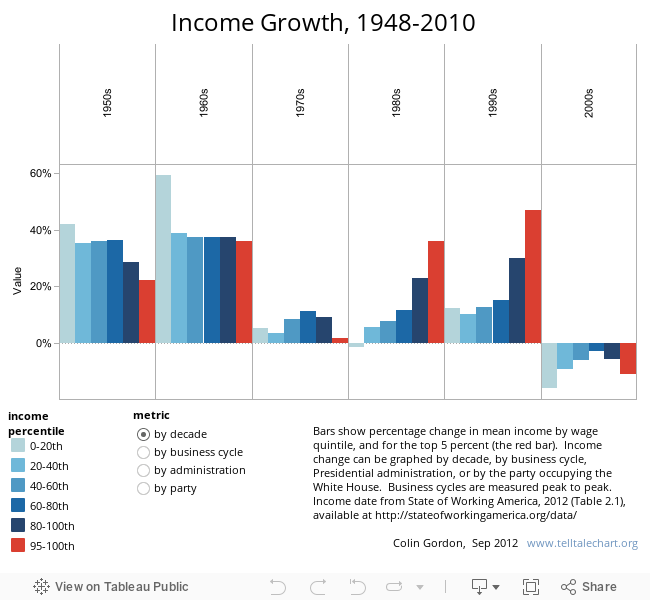
The basic pattern holds--by decade, business cycle, or party-in-power—across the last generation: gains for those in the lower income groups are crowded into the early postwar expansions. Upper income groups, by contrast, share in that early prosperity—and then capture virtually all of the gains of the last thirty years [see FIG above].
In sum, income trends show a dramatic narrowing of early century income gaps during the political and economic upheaval of the 1930s. Broadly shared prosperity was sustained into the early 1970s, but then began to unravel. Since then, we have seen not only a stagnation of wages and incomes at the median, but—especially in recent years--starkly disproportionate gains at the very top of the income spectrum.
Here, the basic story is simple and compelling [see FIGs above]. For the first 30 years after World War II, income for all groups closely tracked the expansion of the postwar economy. We were growing together. For the last 30 years, the gains have been starkly unequal: As productivity and incomes for higher earners continued to rise, the incomes of this in the middle and lower percentiles flattened off. We are growing apart.
The basic pattern holds--by decade, business cycle, or party-in-power—across the last generation: gains for those in the lower income groups are crowded into the early postwar expansions. Upper income groups, by contrast, share in that early prosperity—and then capture virtually all of the gains of the last thirty years [see FIG above].
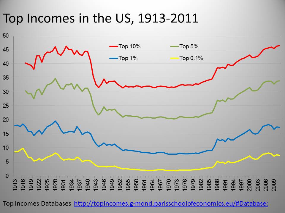
Research based on tax returns over nearly a century confirm this pattern.13 The share of income claimed by the top 10, 5, and 1 percent of households [see FIG below] rose during the roaring twenties and fell back slightly with the onset of the Great Depression. It then fell dramatically in response to the political innovations and institutions of the New Deal and held at that lower level into the 1970s.
Sidebar: Tracking Top Incomes
As the New Deal was dismantled, however, so too was the equality that it had sustained--the share of income claimed by the top 10 percent has now risen to levels not since the 1920s. While these trends can be found across the industrialized world, they are undeniably starker in the United States.
In 1980 [see FIG below]the share of income going to the top 1 percent in the United States was on the high side (about 8 percent)--but similar to that of its international peers. By 2008, this share had ballooned to 18 percent—sharply higher than that of any of its peers, and more than double the share claimed by the top 1 percent in most of those other settings. Narrowing our attention to just the past 20 years, the American “one percent” start with a bigger share than that of any of their peers, and gain more over that span than any of them.14
The magnitude of that redistribution is driven home by recent research from the Congressional Budget Office [see FIG below]. From 1979 to 2007, the after-tax incomes of the poorest 20 percent grew very little, gaining almost nothing in real (inflation-adjusted) value from 1979 to the mid-1990s and inching up during the late 1990s—for a net gain of about 15 percent. Incomes for the middle 60 percent of workers echoed this trend—while the next richest 19 percent did a little better. But the lion’s share has gone to the top 1 percent--whose incomes over that span have almost tripled.15
A nice way to capture this is the Brandeis Index, a measure of the number of full-time median wage workers it would take to accumulate the income of an average “one percenter.” In 1980, this ratio stood at 12.5 to one. By 2007 it had almost tripled, to 36:1.16 High-earners took a hit when the economy collapsed hit in 2007, but their earnings—and their share of national income—have rebounded in recent years. In all, about 15 percent of national income has been transferred from the bottom 90 percent to the top 10 percent since the 1970s.17
Income measures also capture the impact of unemployment, of not earning wages. The period of growing inequality coincides closely with the willingness of policymakers to surf the Philips curve, and accept higher rates of unemployment in order to combat inflation. This not only undercut working class incomes coming and going but, as unemployment crept up in the 1970s, it also eroded the bargaining power of those still working. Unemployment compensation cannot pretend to close this gap: It fails to reach legions of discouraged, marginally-attached, and underemployed workers. And, in our most current downturn, a stark and sustained pattern of long-term unemployment exhausted benefits for many of those hardest hit.18
In sum, income trends show a dramatic narrowing of early century income gaps during the political and economic upheaval of the 1930s. Broadly shared prosperity was sustained into the early 1970s, but then began to unravel. Since then, we have seen not only a stagnation of wages and incomes at the median, but—especially in recent years--starkly disproportionate gains at the very top of the income spectrum.
Back to Introduction
| Previous page on path | Mind the Gap, page 1 of 4 | Next page on path |

Discussion of "A Detailed Look at Incomes"
Add your voice to this discussion.
Checking your signed in status ...