Laws of Interface Design Applied to Course Design in Blackboard LMS
By Ahmed Lachheb, Fort Hays State University
Peter Vukovic, a web designer, published a blog post on January 15, 2014 that made a buzz in social media. The blog post is titled "7 unbreakable laws of user interface design." In his article, Peter gave seven (7) laws of User Interface Design (UID), explained their importance and showed how breaking these 7 laws can cause problems for both parties in the communication channel: the end users (the receiver) and the communicator (the sender).
The purpose of this article is to show how these 7 laws of interface design should be applied to course design in Blackboard Learn LMS. Each ‘law’ will be explained in the way Peter did; then, I will provide a concrete example on how it should be applied in course design in Bb.
1. Law of Clarity
The user will avoid interface elements without a clear meaning.
1. Law of Clarity
The user will avoid interface elements without a clear meaning.
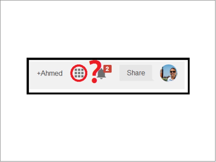
Peter’s version: Gmail used to have a clear text navigation on top of the page when users (with one click) can access Calendar, Drive, Apps and other Google services. When Google decides to make things “simple” and moved all these icons to the on ‘dial pad’ icon (circled in red), a lot of people did not notice that and thus, Google received tons of support requests.
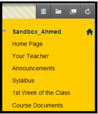
In Blackboard (Bb) course sites, I think this rule applies by recommending the following practice: Title left menu tabs using clear and short words.
In Blackboard (Bb) course sites, I think this rule applies by recommending the following practice: Title left menu tabs using clear and short words.
Instead of “Course Information”, “Syllabus” (one word) is clearer. Instead of “Faculty Information” which may confuse students who may think they will see all the university faculty information or it’s only a tab for a faculty to access, “Your teacher” is more personalized toward the user/student. Also, there is no need to group equally important and different items in one tab; the class “Syllabus” deserves a separate tab from “Course Documents”. The Syllabus tab can contain a lot of other documents such as course calendar, communication policy, grading etc…
2. Law of Preferred Action
The user will feel more comfortable when they understand what the preferred action is.
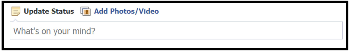
Peter’s version (with slight modification): Upon accessing Facebook (which none needed a trainer to teach him/her how to “Facebook”), users will see two preferred actions that everyone is doing in FB: share a status or answer the questions “What’s on your mind?” (or tell the world what do you think?), or share a photo! If these two preferred actions where hidden somewhere in the home page, or if these actions do not have a slight imperative and interrogative tone, Facebook could end up as empty as many previous social media websites like Hi5 for example.
In Blackboard course sites, I think this rule applies by recommending the following practice: Ask students (end users) to do actions in the course site, explicitly.
Instead of naming the links for assignment drop-boxes similar to the assignment name, adding an “imperative” words will make it clear for users to understand that they have to click to submit.
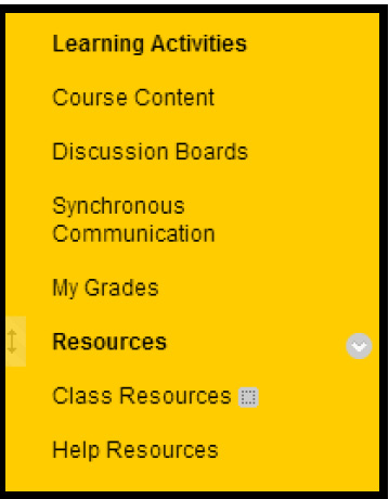
3. Law of Context
The user expects to see interface controls close to the object he wants to control.
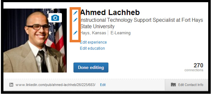
Peter’s version: The users expect to see interface elements within the context of objects they can or want to control (the edit buttons above in the LinkedIn profile image). In real life, when you want to prepare some popcorn, you go to the microwave and flip the switch on the microwave, not in the dishwasher or somewhere else! Otherwise, it would not be practical, hence, it would be very confusing.
In Blackboard course sites, I think this rule applies by recommending the following practice: Keep areas of students / users' inputs within the right context.
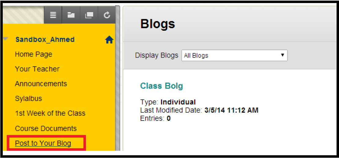
For example, instead of linking the blog into course modules or in any other place in the course content areas, keep the blog in its context and easy to access with one click. The same applies for Discussion Boards or Wikis etc. The idea is to keep things handy for users (students) and accessible where they should. That being said, if you have a final exam, place it under a tab called “Exams” not “Course Information”. Oh yeah….the latter happens many times!
4. Law of Defaults
The user will rarely change default settings.
Peter’s version: The video link (represented by the screenshot on the left side) plays the ringtone of the most popular cellphone brand; NOKIA. When I was 13, everyone knew this ringtone.
On the right side, the famous Windows XP background that we saw in many computers. Indeed, default settings are usually powerful and comes in handy for the vast majority of customers. Most people do not change the background ringtone on their phones, neither the factory settings on their TV sets.
In Blackboard course sites, I think this rule applies by recommending the following practice: Design a course template with strong default settings.
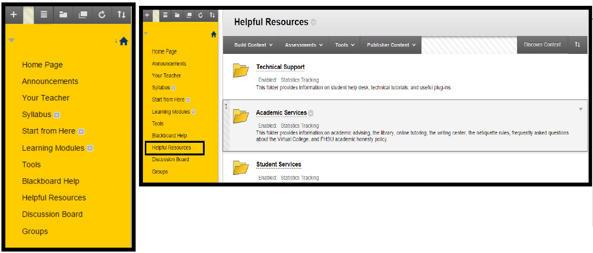
This is the FHSU Bb course template. As you can see, we include some default content folders, we (CTELLT @FHSU) pushed some strong settings for our faculty to encourage them using (e.g. Start from here) and Learning Modules instead of Course Documents.
5. Law of Guided Action
The user will probably do something if he is asked to do it.
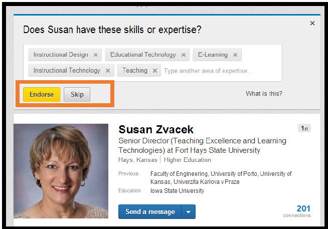
Peter’s version: There is a big difference between expecting users to do something on their own and asking them specifically to do it. LinkedIn has this endorse button that pops out every time you access a profile on your network. Combined with the fact that people like giving endorsements and to help each other, it made this feature a huge success.
In Blackboard course sites, I think this rule applies by recommending the following practice: Ask students/ users to take actions as soon as they log in to the course / system.
The access point of almost all courses in Bb is the Announcements page or the Home Page. On both pages, users will see their announcements as the first thing.
The user will probably do something if he is asked to do it.
Peter’s version: There is a big difference between expecting users to do something on their own and asking them specifically to do it. LinkedIn has this endorse button that pops out every time you access a profile on your network. Combined with the fact that people like giving endorsements and to help each other, it made this feature a huge success.
In Blackboard course sites, I think this rule applies by recommending the following practice: Ask students/ users to take actions as soon as they log in to the course / system.
The access point of almost all courses in Bb is the Announcements page or the Home Page. On both pages, users will see their announcements as the first thing.
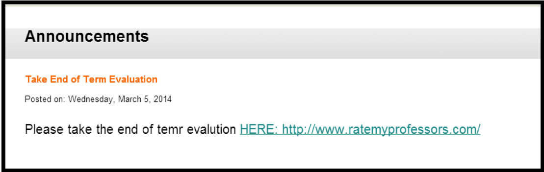
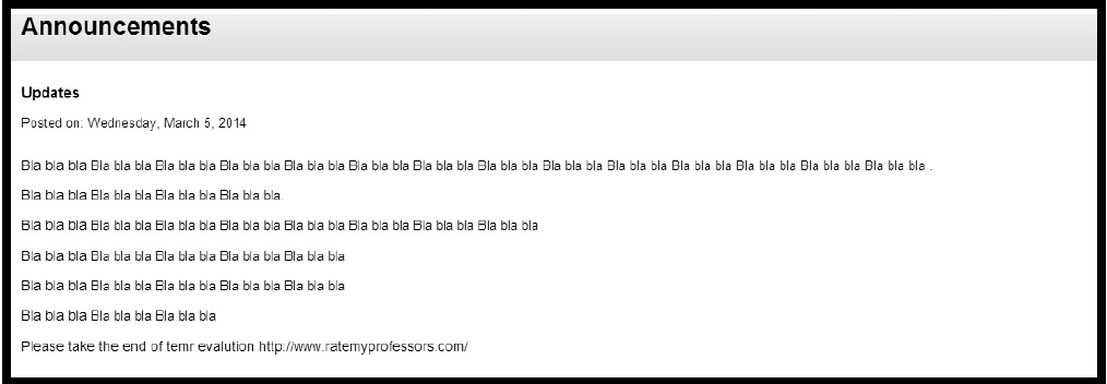
In sending/posting Announcements that require immediate action (e.g. end of term evaluation), having the title of the announcement about that "guided action” and making the announcement only about that is crucial.
Imagine that the above announcement was like this:
How appealing will it be that students take end of term evaluation?
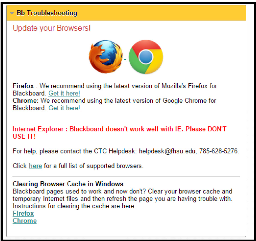
The moral of the story is; if you want users do to something, ask them without hesitation as soon as they have contact with the interface that you control. When students and faculty log in to Bb at FHSU, they see the below message. Yes, IE is not a browser supported by FHSU :D
6. Law of Feedback
The user will feel more confident if you provide clear and constant feedback.
As Peter said “This is simple logic — the more users feel your interface is communicating an action, the more confident they will feel. Gmail is a great example of good feedback. You will get a clear notification for every action you take, including Learn more and Undo links. This makes people feel in control and makes them confident to use the product again.”
In Blackboard course sites, I think this rule applies by recommending the following practice: Put built-in feedback in every test / quiz or an exam's questions.
Instead of showing the students/users what are the wrong answers and the right answers, building feedback that goes to them as soon as they finish taking the test/exam will enable students to believe that they have a real teacher behind the screen. Customized feedback is an extra great step as well.
7. Law of Easing
The user will be more inclined to perform a complex action if it’s broken down into smaller steps.
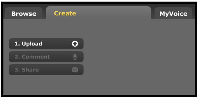
VoiceThread.com nailed this rule! Creating multimedia presentations using a cloud software never seemed easy. Peter gave the example of online forms saying “We all hate filling out long, complicated forms because they seem boring, overwhelming and hard to double-check. But if you split the form into several steps and show a progress bar, things become pretty manageable.”
In Blackboard course sites, we think this rule applies by recommending the following practice: Break down left menu items into groups.
Using headers will ease the access and the understating of every left side menu item.
Users/students in this case will be able to know where the learning activities are, where the general information about the course are and easily access them. Course sites in Bb should be universally designed in way they make sense for the Instructional Designer, the instructors (or SMEs), guest/evaluator and more importantly the students.
Laws or Guidelines?
Peter used the word “law” in his article for a reason. He claims that he had “never seen a case where breaking this law produced a more favorable result. There is a punishment for breaking these laws, and it comes in the form of grumpy users who rant about your bad user interface.” I agree with him, pretty much!
About the Author
Ahmed Lachheb is the Instructional Technology Support Specialist at the Center for Teaching Excellence and Learning Technologies at Fort Hays State University. He holds a Master's Degree in Educational Technology from Grand Valley State University, College of Education. Ahmed is famously known as the "Blackboard Guru" on Fort Hays campus. He is passionate about educational technology and best practices to integrate Ed Tech tools for good teaching and learning experience. He's also a young scholar with few publications and conference proceedings in the field of instructional systems, design and Ed Tech. Ahmed is originally from Sfax, Tunisia, and he came to the US in 2010 as part of the NESA UGRAD Fulbright Exchange Program. He's married, and his love to cook almost equals his love of his job and his wife (aka the love of his life, Victoria Abramenka).
| Previous page on path | Cover of C2C Lantern (Fall 2014 / Winter 2015), page 4 of 20 | Next page on path |
Discussion of "Laws of Interface Design Applied to Course Design in Blackboard LMS"
Add your voice to this discussion.
Checking your signed in status ...