The Humble “Funnel Chart”
By Shalin Hai-Jew, Kansas State University, USA
A search for “funnel chart” in Google Scholar results in 392 results (in 0.06 sec) only. That is a pretty low count for a nifty data visualization type available in Excel 2013 - Excel 2019.
And yet, in the popular space, these have become much more common ways of sharing information. Within Excel 2019, the context-sensitive help describes this visualization:
A funnel chart represents stages in a process showing progressively decreasing proportions. (Excel 2019)
A funnel chart is straightforward and effective for many real-world phenomena.
Some Examples of Funnel Charts on Social Web
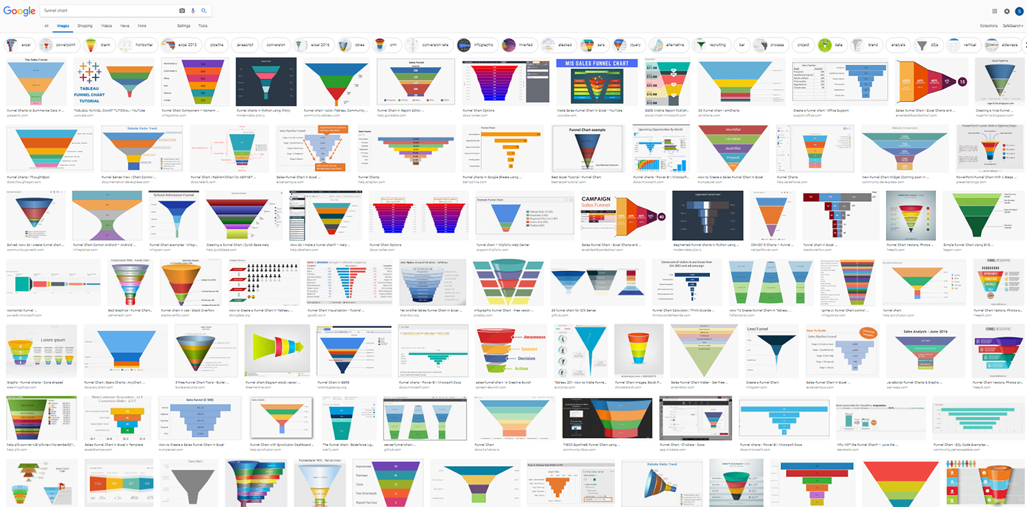
On Google Correlate, “funnel chart” results in plenty of correlated time patterns linked with other search terms: powershell, countif, cpt, excel formula, ckd, vlookup, pivot table, kpi, sumif, cmkae, python set (in descending order for 0.9066 to 0.8993) and so on. On Google Images Search, the tags for “funnel chart” are the following: excel, powerpoint, horizontal, excel 2013, pipeline, javascript, conversion, excel 2016, obiee, crm, conversion rate, infographic, inverted, stacked, ssrs, jquery, alternative, recruiting, bar, process, project, data, brand, analysis, d3js, vertical, sideways, vector, (and) graph. The results of a search in early 2019 follows in Figure 1.
Figure 1. "Funnel Chart” on Google Images Search
As with many of the best types of data visualizations, funnel charts are intuitive. There are many varieties of them. The most common forms are vertical ones and read from top to bottom, but there are some that are horizontal and read from left to right. Many creatives have added cool elements that hint at dynamism or motion. Some of the visuals have “transitions” between the funnel layers. Some are stacked cluster funnels, addressing multiple dimensions of a phenomenon. (More on this will follow.)
The phenomenon represented are varied. In general, these show descending values but not always. The respective counts seem to align with spatiality (so higher counts result in higher area coverage) but not always. Certainly, with the various features in Excel visuals, it is possible to change up sizing, colors, labels, and so on.
Some Basics of Funnel Charts
In an informal exploration of funnel (area) charts, the basic data structure is as follows (Table 1). There are only two data columns required. The left one should contain the various category labels, and the corresponding cell to the right should contain a frequency or count or value. The categories should be parallel in phrasing and type, and the values should all be of a similar base unit of measure (for clarity and comparability). Some may prefer to have column labels in the first row, but these are not needed for a basic funnel chart. And if additional custom labeling is desired, text boxes are always an option. In general, funnel charts show values of gradual descending order, and often, chronological time is a factor. And finally, the categories and frequencies together represent a particular construct; they are of a piece.
| Category A | Frequency (Count) |
| Category B | Frequency (Count) |
| Category C | Frequency (Count) |
| Category D | Frequency (Count) |
Table 1. The Basic Data Structure of a Funnel Chart
What is novel in funnel charts is the lessening of occurrences of the phenomenon over time based on the funnel metaphor. As such, in the most simplified senses, a funnel chart seems to be a mix of an area chart and a timeline. An inherent question built into funnel charts is, “Why are there diminishing numbers in this phenomenon over time?”
Figure 2 shows a funnel of the STEM pipeline with 2008 data and anticipated outcomes. This funnel is based on the NCES Digest of Education Statistics, with Science and Engineering indicators. This visualization suggests the importance of retaining as many people as possible at each phase of their learning.
Figure 2. STEM Pipeline (for Science, Technology, Engineering, and Mathematics Graduates in the U.S.)
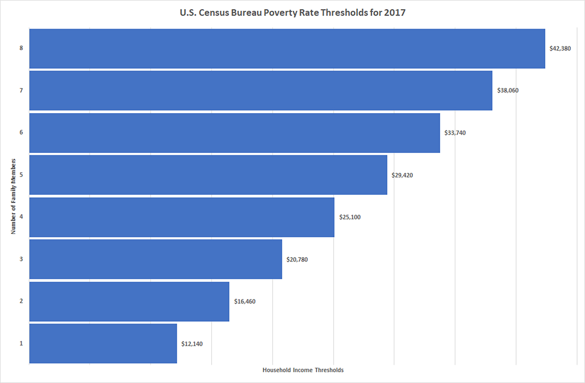
Figure 3 uses real-world U.S. Census Bureau poverty rate thresholds from 2017.
Figure 3. U.S. Census Bureau Poverty Rate Thresholds for 2017 (as a half-funnel)
It seems like only the vertical funnels are possible in Excel, but there could be some workarounds to make horizontal ones.
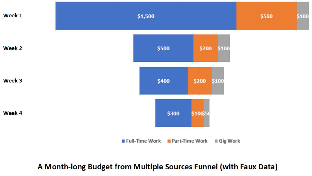
And it looks like multiple-sourced funnel charts may be made with all the data melded, but something like Figure 4 is not quite possible within Excel. Figure 4 was made as a horizontal stacked bar chart, and then the stacks were pasted into MS Visio, centered, and output as a visualization. Sometimes, workarounds are not that pretty. There are software programs that enable the formation of these types of funnel charts, but not in Excel 2019 as-yet.
Figure 4. A Month-long Budget from Multiple Sources Funnel (with Faux Data)
About the Author
Shalin Hai-Jew works as an instructional designer at Kansas State University. Her email is shalin@k-state.edu.
| Previous page on path | Cover, page 14 of 23 | Next page on path |
Discussion of "The Humble “Funnel Chart”"
Add your voice to this discussion.
Checking your signed in status ...