Using the 3D Map Feature in Microsoft Excel 2016
By Shalin Hai-Jew, Kansas State University
For those who want to draw maps—local to global—using simple data, there is a cool built-in 3D visualization tool in Excel 2016. This short article presents the steps to accessing this new feature.
To begin, open Excel 2016 (or a later version). Input the locational data in the data cells. The locational data can go in as text. Or it can go in as typical geographical latitude-longitude data. The basic requirement is that the related data should all be in the same table (not with data on different pivots of a pivot table). (“Get and prep your data for 3D Maps”) This new capability enables up to a million rows of data.
Example: Cities in Kansas
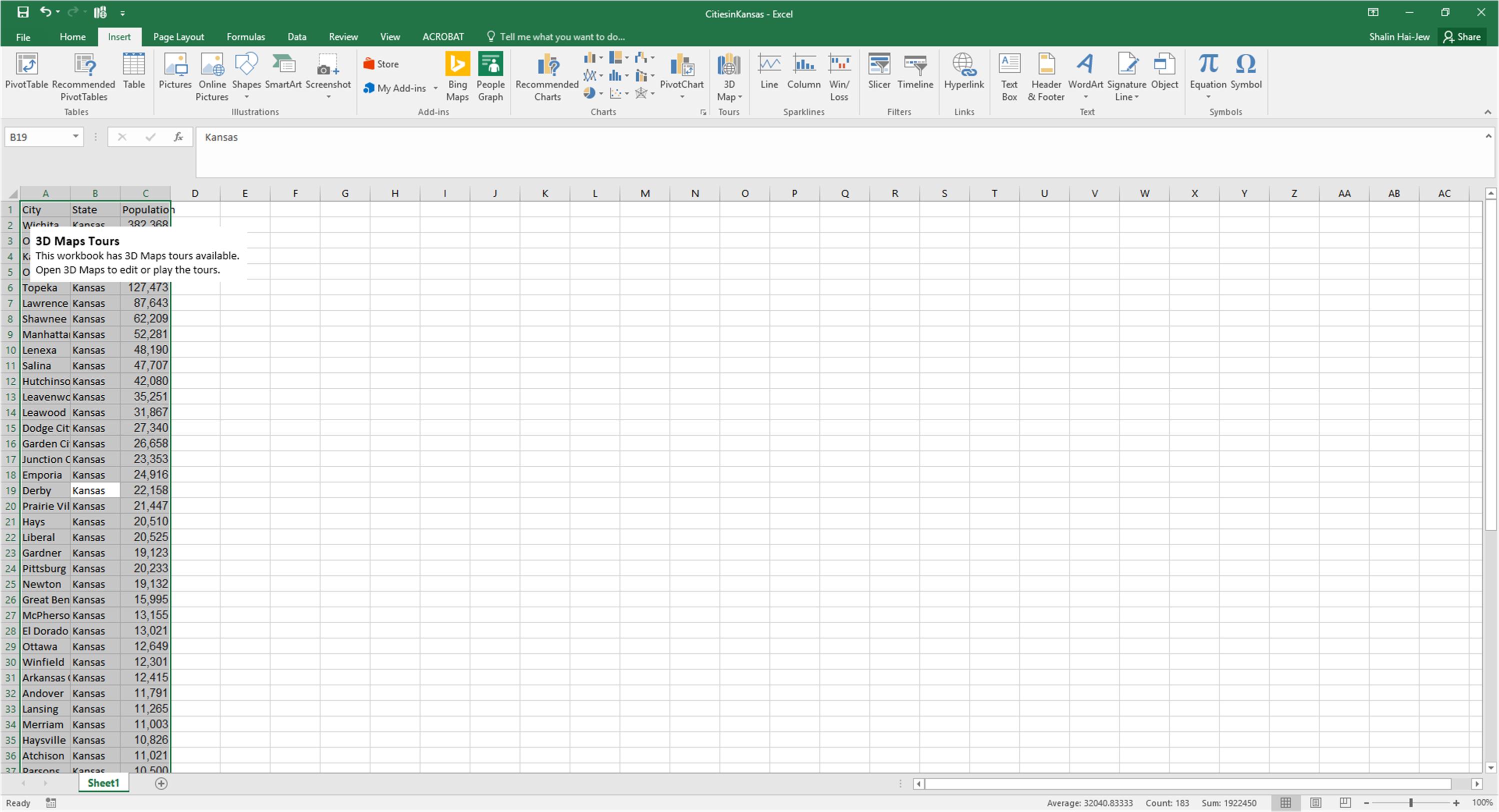
For this example, a list of cities in Kansas was taken from Wikipedia (“List of cities in Kansas”) The first column shows the city name, the second the state, and the third, the 2010 population of that city from the U.S. Census. Use the first row to label the data for clarity.
Highlight the data. (Click one of the cells, and hit CTRL + ALL.)
From the Insert tab, go to the “Tours” group and “3D map.”
Figure 1: Cities in Kansas and their Populations Data in 2010 (in Excel 2016)
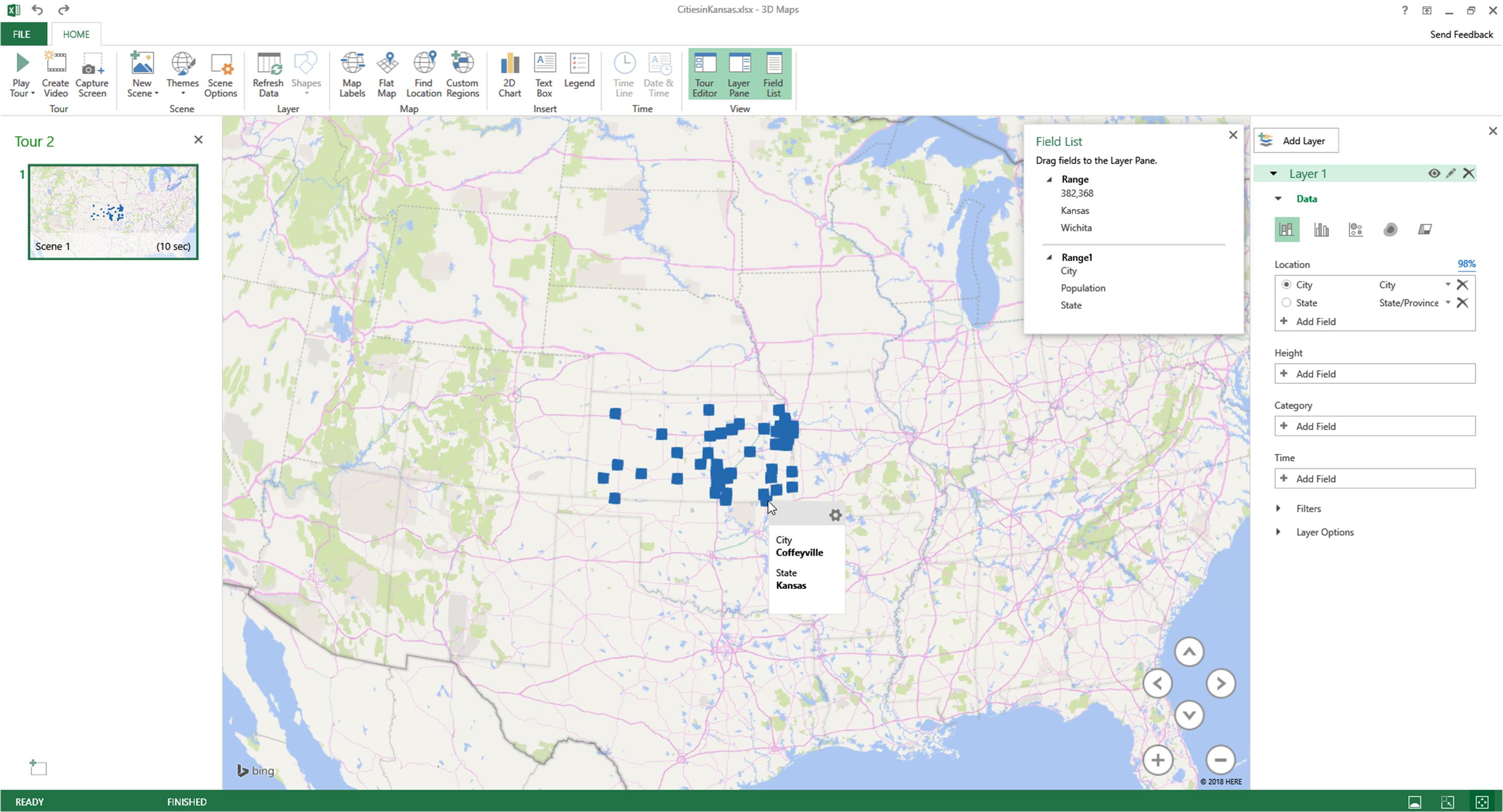
The data will open in the 3D maps visualization. Each visualization is a visual “tour” of the data based on the nomenclature.
Figure 2: The Initial 3D Maps Visualization
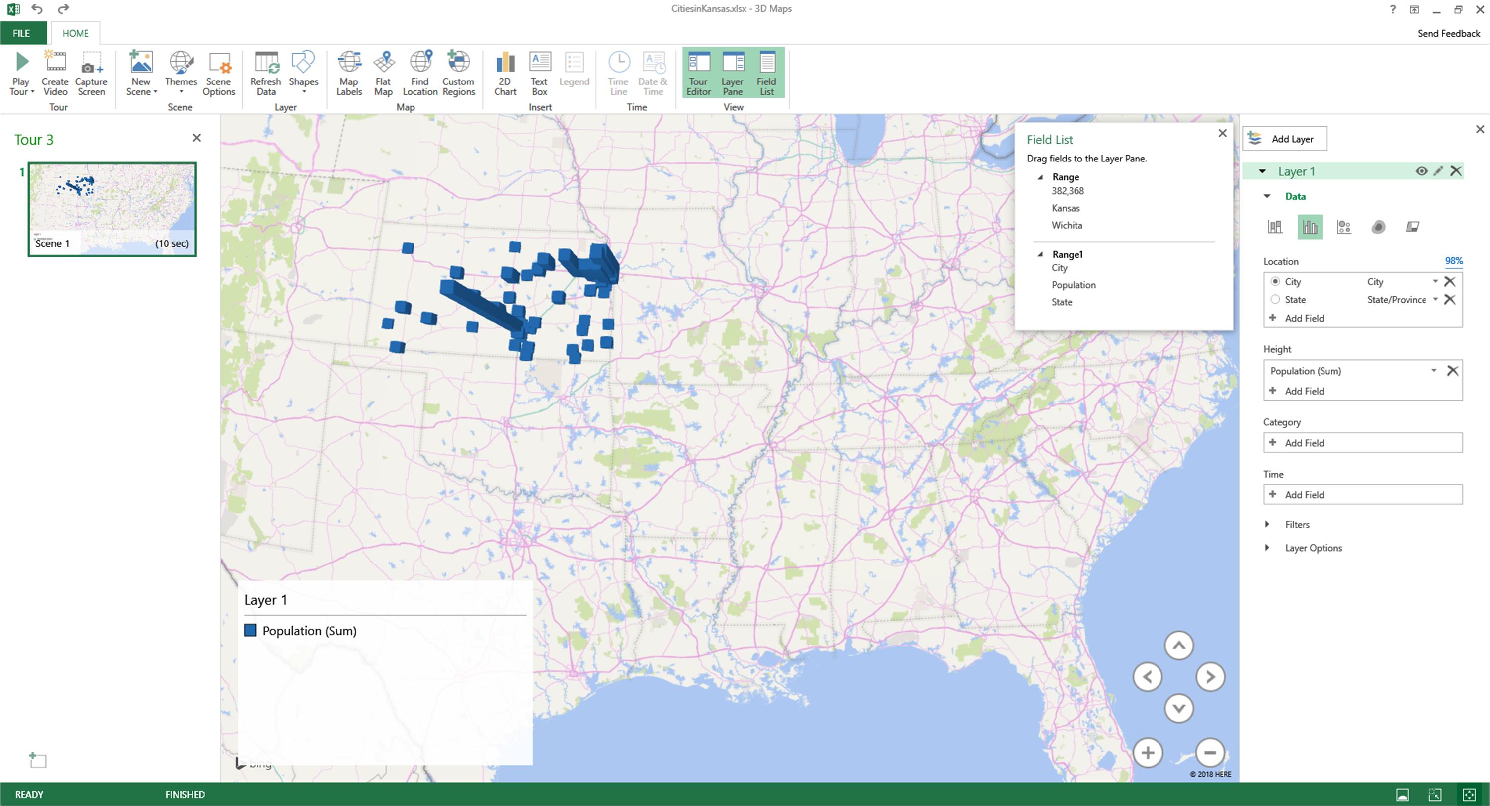
To the right is an attribute pane. Right now, this map has only one layer, with the city locations. The level of zoom is determined by the size of the data (in this case city views within a state, within the visual context of the mainland U.S.). With a mouseover one of the blue squares, the target location is shown.
To the right of Layer 1 is an eye…which enables toggle on / toggle off for the data. To the right of that is a pencil, which enables editing of the layer (including renaming it). The “x” enables the permanent deletion of the layer.
Clicking at the “Add Layer” will result in an overlay on which additional spatial-based data may be added.
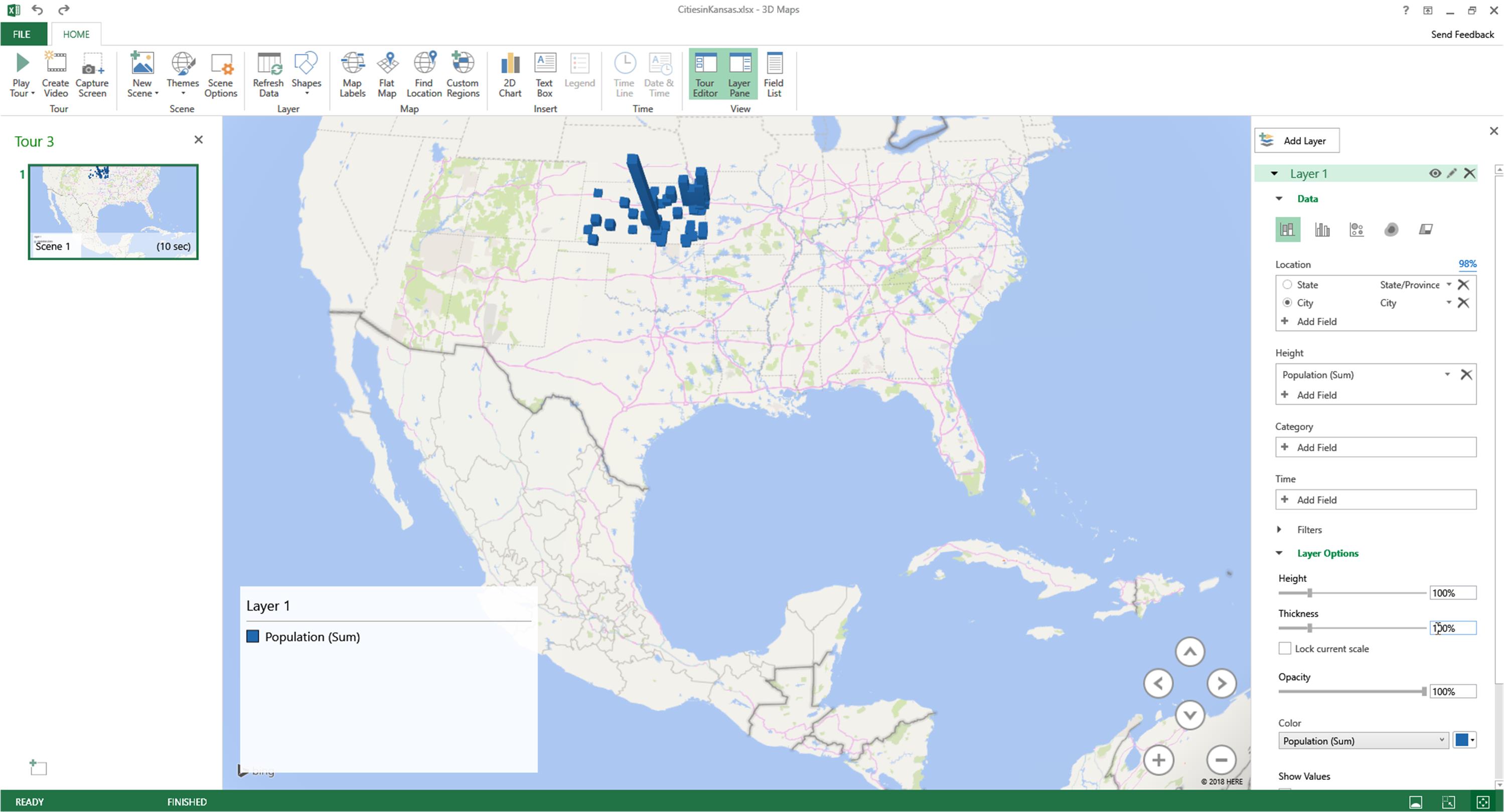
To bring in the population column, click “Add Field.” The first population in 1C shows up in lieu of a header for the population data. The locational indicators now show height based on population, with a clustering of population in particular counties and also regions. Note that the visualization was zoomed in and spun on its axis to enable the blue bars to indicate population counts (as height).
Figure 3: Combining the Population Data with the Locational Data
If the data had been loaded with other features, such as average wages or median population ages or other details, each layer brings new data.
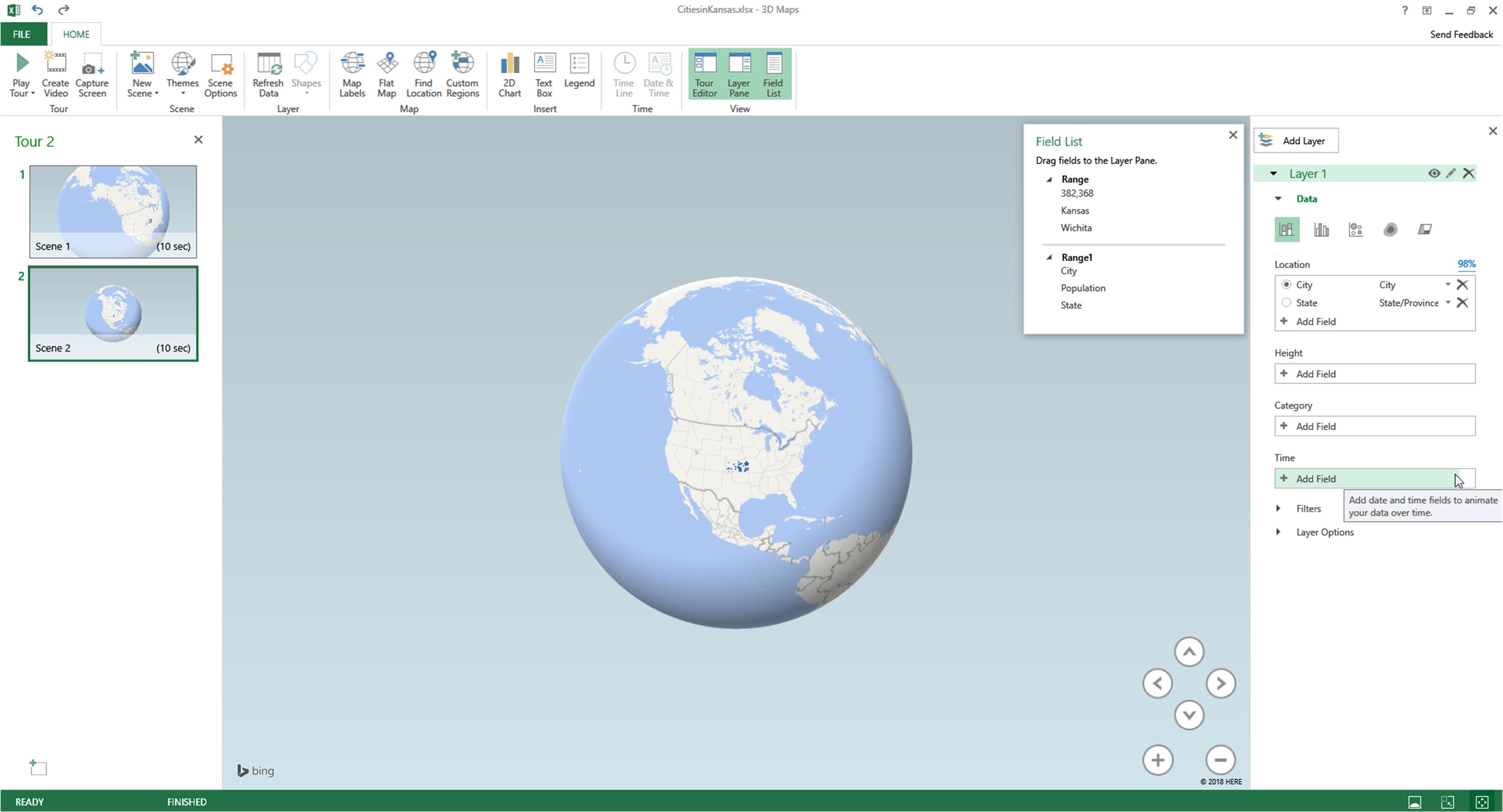
To interact with the visualization, there are arrows to move directionally…and a plus and minus sign to zoom in or out. (The “grab and drag” also works to change the view of the map. The scroll wheel of a mouse enables zooming in and zooming out.)
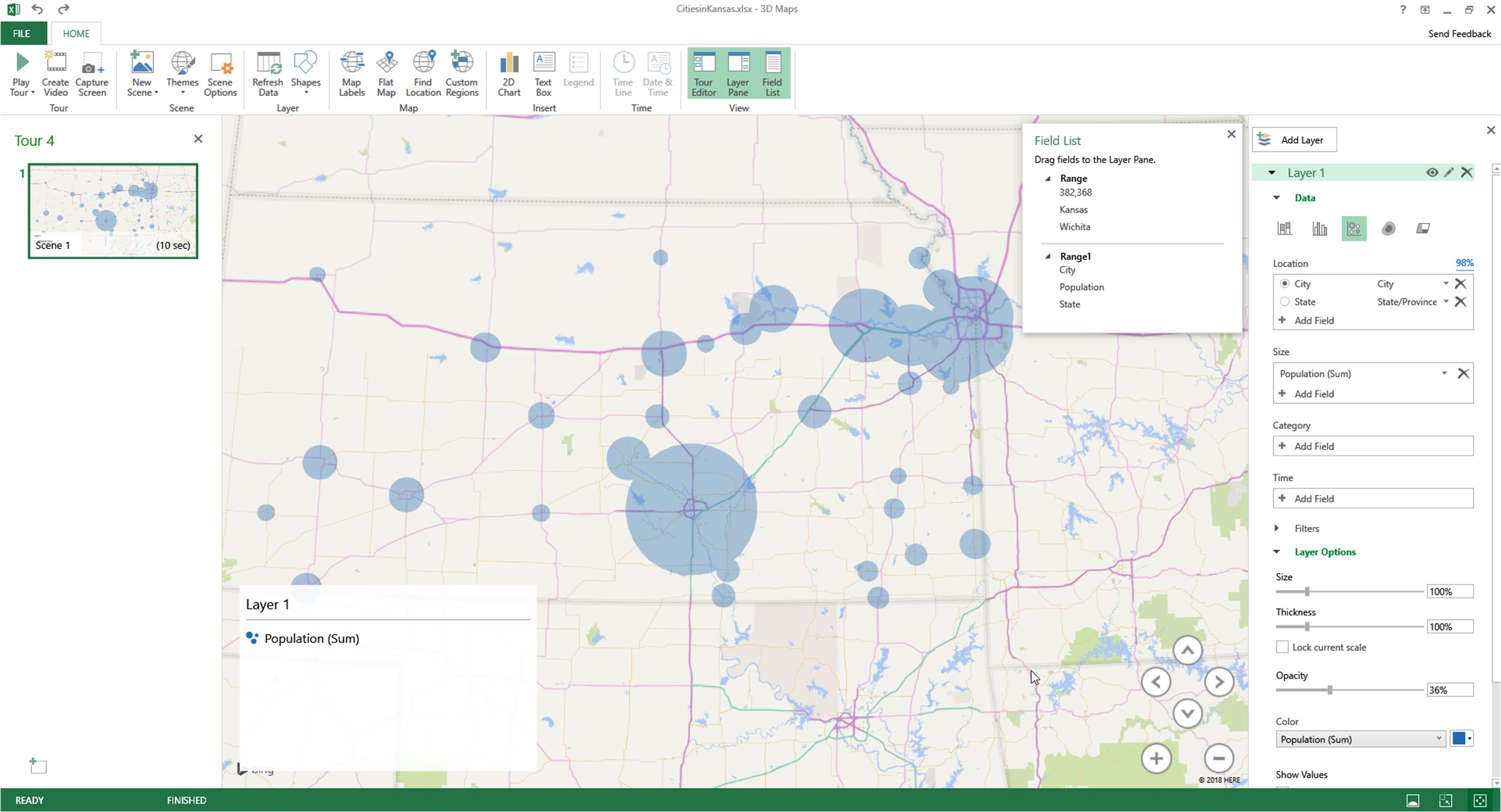
A bubble view with 36% opacity gives another sense of the data.
Figure 4: A Bubble View of the Cities in Kansas Population Data
Zooming In and Zooming Out
Figure 5: A Zoomed-in View of the City Population Data from 2010
Figure 6: A Zoomed-out View of the Cities in Kansas Population Data from 2010
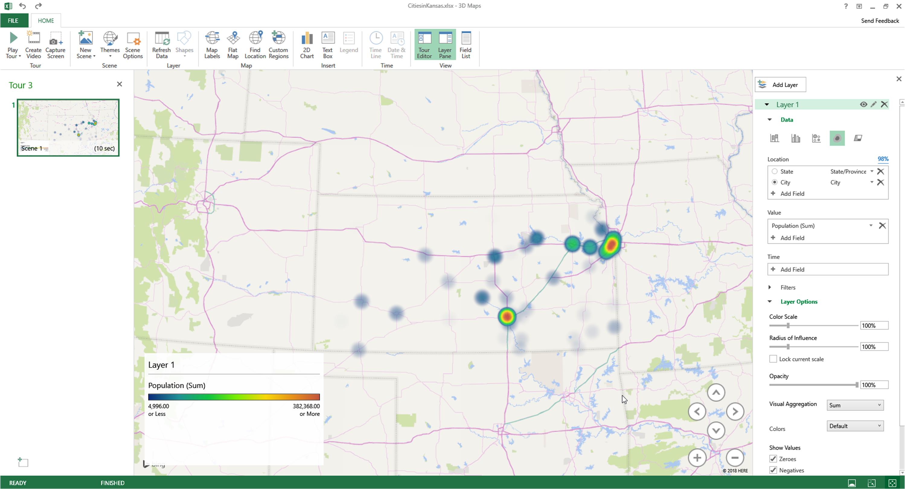
Figure 7: Cities in Kansas Population in a Heatmap Visualization
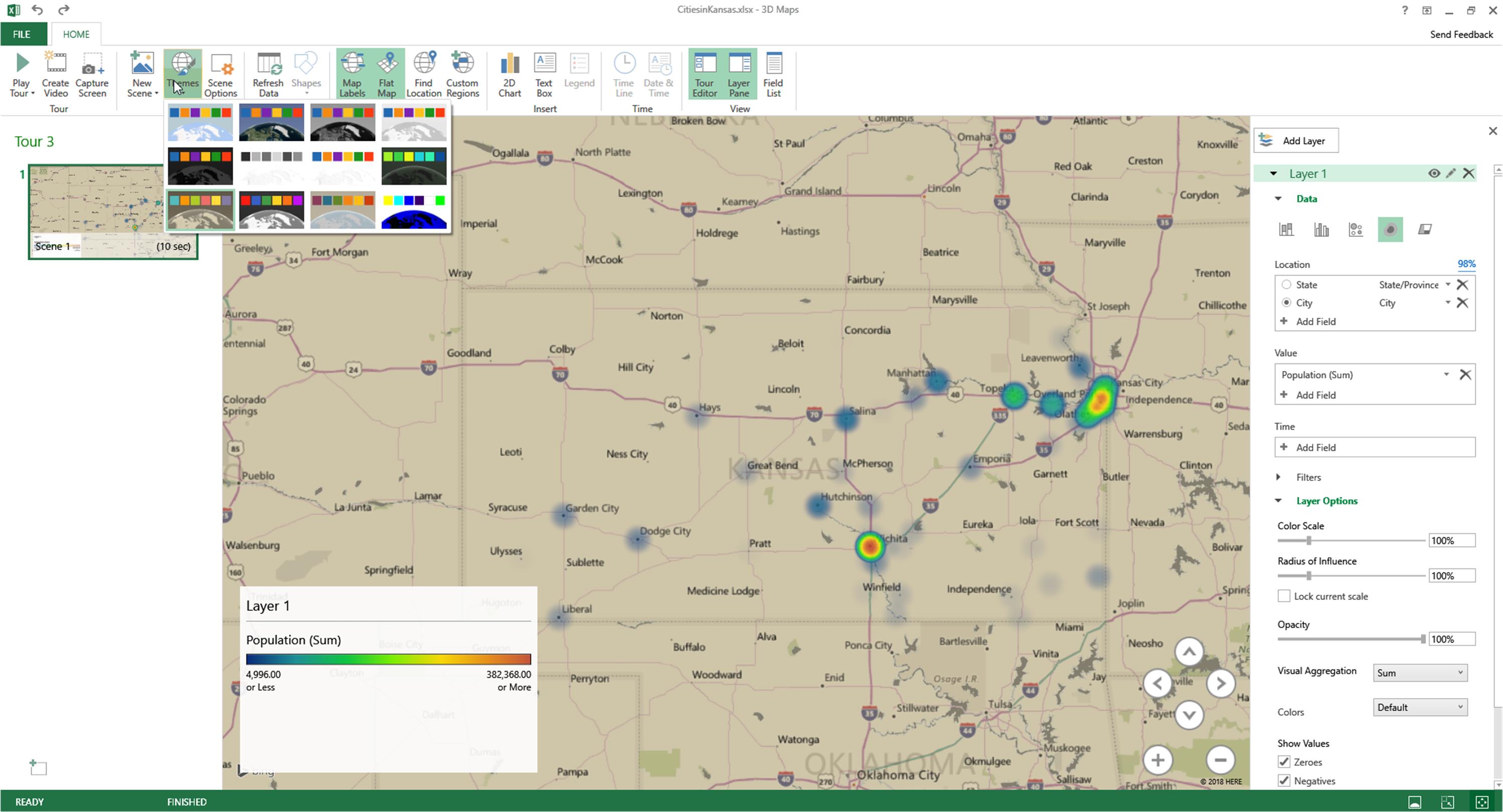
Applying “Map Labels” enables a clearer sense of location, and flattening the map provides more of a classical map reading feel. A range of color themes may be applied to the map, for exploratory purposes.
Figure 8: Color Themes, Map Labels, and Flattening for Exploration and Presentation Effects
It is possible to add text boxes into map visuals.
Maps in Time
This 3D Map tool is not meant just to create static maps. The idea of a “tour” is that it shows a map changing over time, so one can begin with different population iterations to show changes over time, for example. The tours are showcased in progression in the left column.
The “Play Tour” button in the Home menu enables the tour to be played over time. This sequence may be created into an .mp4 video with the “Create Video” button, with outputs in three sizes (360 pixels, 720 pixels, or 1080 pixels). There are options to bring in a soundtrack, with some looping and fade-in, fade-out options. As more contents are brought into play, it is possible to place these map sequences into Time Lines…to add glitz and glamor to maps.
For those who have more video editing experience, they may export the various map sequences as compressed video snippets and integrate these into more complex videos.
Excel and 3D / 2D Maps
For any technical capability, it helps to see how others have harnessed the tool. One effective example shows the uses of maps and data to tell a data story about U.S. power production. This was built using a precursor tool known as Power Map (in Excel 2013). The resulting video is well-paced, with clear mapping, and it tells a data story of development in time factually but without narration.
Video Source: U.S. Power Production: A Power Map for Excel Tour
This next video shows a walk-through in the use of 3D Maps in Excel 2016. This video is also not narrated, but it may be helpful for those who might want a step-by-step. The creators of both videos have been credited in the metadata.
The 3D map feature in Excel 2016 is an advancement from Power Map (in Excel 2013). In many ways, this is a bridging tool to an actual high-powered mapping tool like ESRI’s ArcMap / ArcGIS Desktop.
References
Get started with 3D maps. (2018). Microsoft Office Support. Retrieved from https://support.office.com/en-us/article/get-started-with-3d-maps-6b56a50d-3c3e-4a9e-a527-eea62a387030.
About the Author
Shalin Hai-Jew works as an instructional designer at Kansas State University. Her email is shalin@k-state.edu.
| Previous page on path | Cover, page 17 of 23 | Next page on path |
Discussion of "Using the 3D Map Feature in Microsoft Excel 2016"
Add your voice to this discussion.
Checking your signed in status ...